My branding
The Miguel Magueijo brand came to life on April 13th of 2024. It all started with a chat between two friends, Miguel Magueijo and Tiago Oliveira, about a logo concept.
Originally, the idea was to create a logo with two stacked M's, with a bit of an angle to give a style to it.
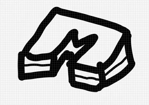

After both Miguel and Tiago took a good look at the logo, it became evident that the initial idea wasn't quite hitting the mark. It seemed like it might be a bit tricky for people to figure out what exactly the logo was all about.
But then, in the blink of an eye, inspiration struck Tiago. He whipped up a whole new logo in just minutes and shot it over to Miguel.
At first glance, Miguel was a bit skeptical about the new design since it resemblance a crown. However, with each passing glance, Miguel's skepticism gradually transformed into approval. What won him over was its simplicity and immediate clarity.
As Miguel and Tiago continued to discuss the logo, they couldn't resist comparing it to the original concept.
The comparison between Tiago's proposed logo and the original left no doubt: Tiago's design was the winner. With that settled, Miguel and Tiago set out to enhance it further.
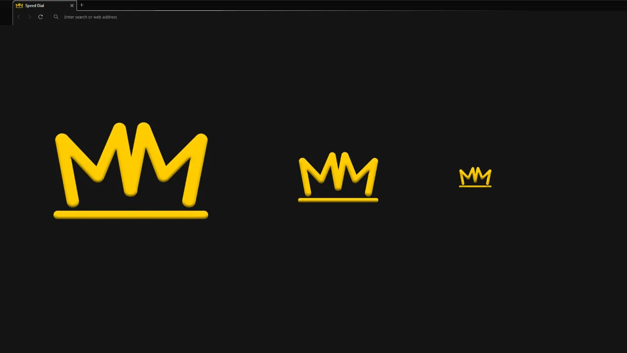
They agreed to adjust the underline to match the width and thickness of the M letters, as depicted in the left image below.
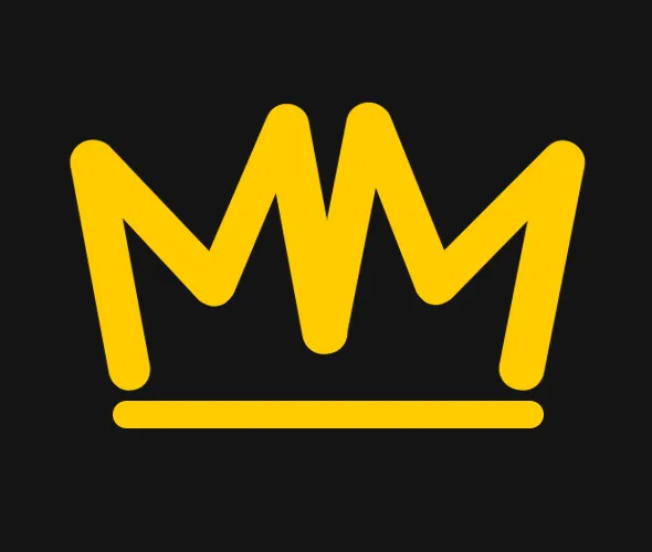
But it didn't stop there. Miguel felt strongly about incorporating two colors into the logo, not just one for the M's and underline. So, they brainstormed and came up with the idea of adding a cut between the two M's, allowing for the introduction of two distinct colors. The result is shown in the right image below.

Once the cut was introduced, it was as clear as day that their objective had been achieved. All that remained was to settle on the colors for the new logo.
With the help of Figma app, they created several color themes to explore and experiment with.
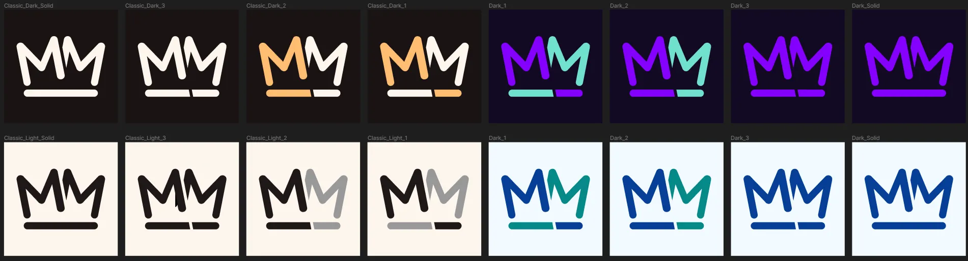
After finalizing multiple color themes, it was time to implement the changes and officially adopt this new "brand" on the website. Thus, what you're currently seeing as the website's brand is a simple idea that has its origins from a conversation between two friends discussing a logo concept.
Special thanks
Big thanks to Tiago Oliveira for helping bring my new logo to life! He took my initial idea and ran with it, even offering up an awesome alternative design that ended up being the winner.
If you're digging this logo as much as I am, check out Tiago Oliveira's work on Behance. Hit him up for logo design or any other cool projects you've got in mind!
And hey, there's also a cool post about this brand on his Behance profile.